The Cartographer's First Lie
The oldest known world map, carved into a Babylonian clay tablet around 600 BCE, shows Babylon at the center of a flat disc surrounded by water. This wasn't ignorance—it was ideology. The Babylonians knew their city wasn't the geographic center of anything, but they understood something more important: whoever controls the map controls how people think about the world.
This principle has governed cartography for five millennia. Maps have never been neutral representations of physical reality. They are arguments made manifest in ink and projection, designed to convince viewers that the mapmaker's version of the world is the only reasonable one. The psychology behind this hasn't changed since humans first scratched territorial boundaries in the dirt.
The Roman Method: Making Conquest Look Natural
Roman cartographers perfected the art of geographical propaganda. Their maps consistently portrayed Roman territories as naturally unified landmasses, while enemy territories appeared fragmented and chaotic. Rivers became 'natural boundaries' when they served Roman interests, and were ignored when they didn't.
The famous Tabula Peutingeriana, a Roman road map stretching from Britain to India, deliberately distorted distances and directions to make the empire appear more connected than it actually was. Roads leading to Rome were drawn wider and straighter than they were in reality. The message was clear: all paths lead to the eternal city, and resistance to Roman rule meant fighting against geography itself.
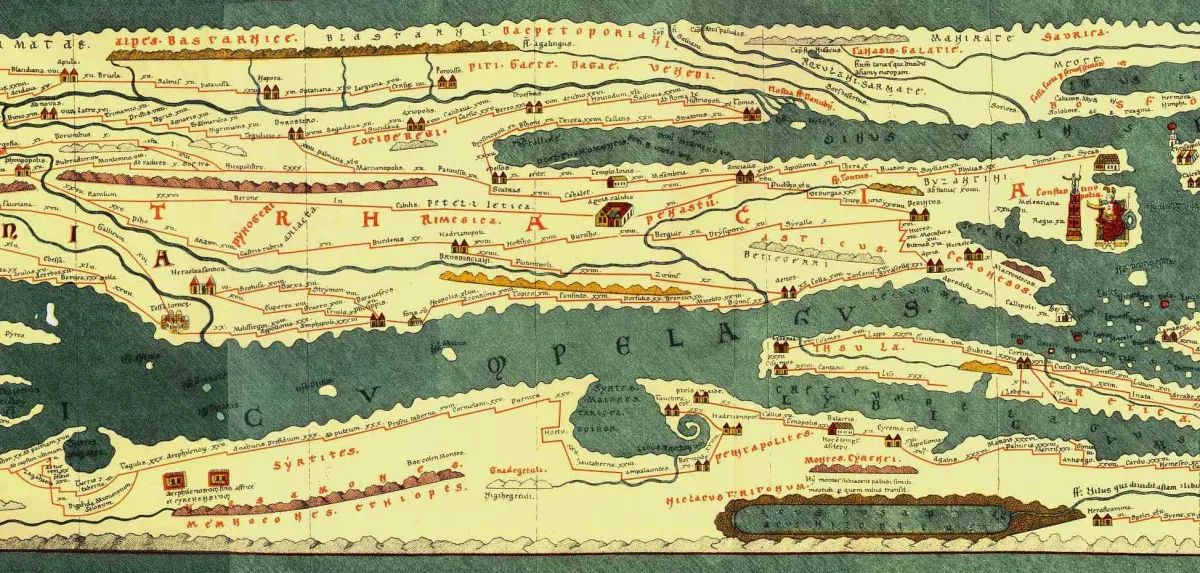 Photo: Tabula Peutingeriana, via markcnewton.com
This psychological technique—making political arrangements appear to flow from natural law—remains the gold standard of cartographic manipulation. Modern politicians still invoke 'natural borders' and 'geographic logic' when they want to make territorial claims sound inevitable rather than aggressive.
The Medieval Deception: Sacred Geography
Medieval European maps placed Jerusalem at the center of the world, not because mapmakers believed it was geographically central, but because it was spiritually central to Christian cosmology. The famous Hereford Mappa Mundi, created around 1300, shows Jerusalem as the literal center of creation, with Europe, Asia, and Africa arranged around it.
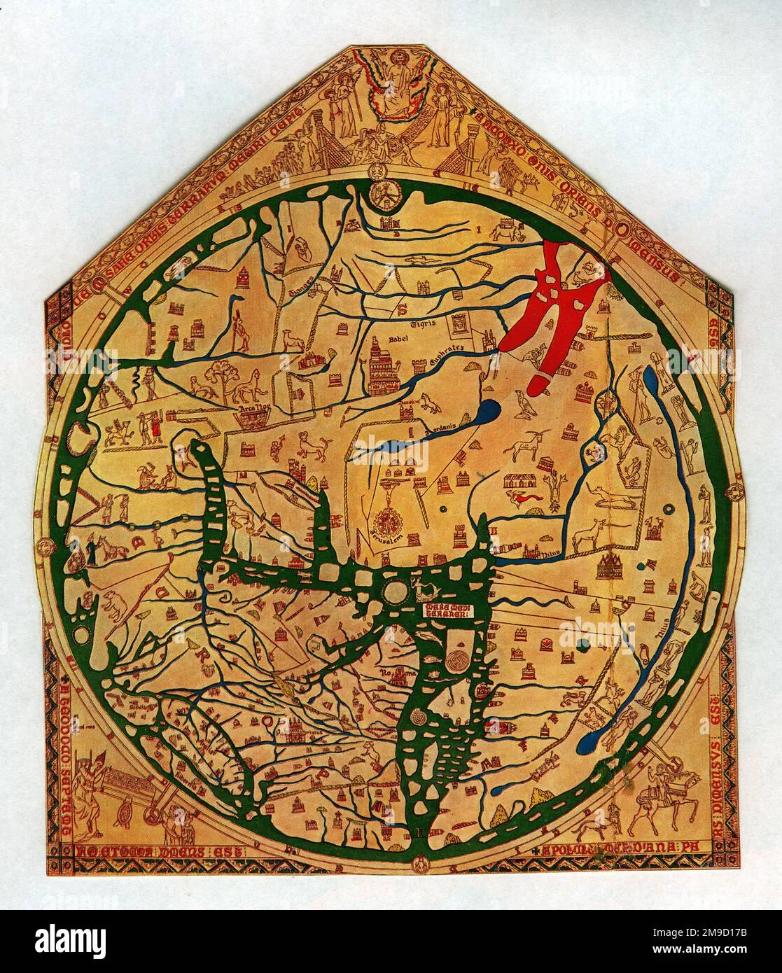 Photo: Hereford Mappa Mundi, via c8.alamy.com
These maps weren't failures of geographic knowledge—they were successes of religious propaganda. By making sacred geography appear to be physical geography, medieval cartographers transformed theological arguments into apparent statements of fact. The Crusades weren't wars of conquest; they were journeys toward the center of the world.
The psychological appeal was profound. If you could convince people that their religious beliefs were written into the very structure of the earth, you could justify almost any military expedition as a return to natural order.
The Colonial Calculation: Making Empires Look Inevitable
European colonial maps of the 18th and 19th centuries refined cartographic propaganda into a science. British maps consistently used the Mercator projection, which made northern territories appear larger than they actually were, while tropical colonies appeared smaller. This wasn't accidental—it made the British Isles look substantial enough to plausibly govern a global empire, while making colonial territories appear manageable.
French cartographers developed their own techniques. Their maps of North America in the 1750s showed French territory as continuous and naturally unified, while British colonies appeared as disconnected coastal settlements. When the Seven Years' War began, French maps had already won the propaganda battle by making French victory look geographically inevitable.
The genius of colonial cartography was its ability to make conquest appear like discovery. By leaving enemy territories blank or marking them as 'unexplored,' European mapmakers transformed military campaigns into scientific expeditions. They weren't invading; they were filling in the gaps.
The Cold War Canvas: Ideology Made Visual
Cold War maps represent the peak of cartographic manipulation. Soviet maps showed the USSR as a massive, unified landmass stretching across two continents, while American territories appeared as scattered islands. American maps emphasized NATO alliances, using color coding to make the 'free world' appear as a natural geographic unit.
Both sides manipulated scale and projection to serve their narratives. Soviet world maps minimized the size of the United States while exaggerating Soviet territory. American maps did the reverse. Neither was technically lying, but both were psychologically manipulating their audiences through careful choices about what to emphasize and what to minimize.
The most sophisticated Cold War cartographic weapon was the 'missile gap' map. American defense contractors created maps showing Soviet nuclear capabilities that deliberately exaggerated both the number and range of Soviet missiles. These maps weren't classified intelligence—they were public relations tools designed to justify increased defense spending.
The Digital Deception: Your Phone's Political Map
Modern digital maps continue this five-thousand-year tradition of cartographic propaganda, but with unprecedented sophistication. Google Maps shows different borders depending on where you're viewing from. Kashmir appears as part of India when viewed from India, part of Pakistan when viewed from Pakistan, and disputed when viewed from the United States.
This isn't technical limitation—it's deliberate political calculation. Tech companies have discovered what every empire before them knew: controlling the map means controlling the argument. By customizing geographic reality for different audiences, digital cartographers have perfected the art of making everyone's version of the world appear objectively true.
Apple Maps sparked a diplomatic crisis in 2019 when it showed Crimea as part of Russia for Russian users but as disputed territory for everyone else. The company's response revealed the eternal cartographic truth: there is no neutral map, only maps that serve different political interests.
The Unchanging Psychology
The human brain treats maps as objective representations of reality, even when we intellectually know they're subjective interpretations. This cognitive bias hasn't changed in five thousand years. Ancient Babylonians trusted their clay tablets the same way modern Americans trust their GPS devices—not because the information is necessarily accurate, but because it appears authoritative.
Every society under pressure eventually weaponizes geography. The technique is always the same: make your political preferences appear to flow from natural law. Whether you're a Roman senator justifying conquest or a tech executive deciding which borders to display, the psychology remains identical—convince people that your version of the world is the only reasonable one.
The map always lies, but it lies in service of whoever draws it. Understanding this doesn't make us immune to cartographic manipulation, but it might make us more skeptical the next time someone uses a map to prove their point. In the five-thousand-year war over who controls geographic truth, the only winning move is to remember that every map is someone's argument disguised as fact.